CapitalOne
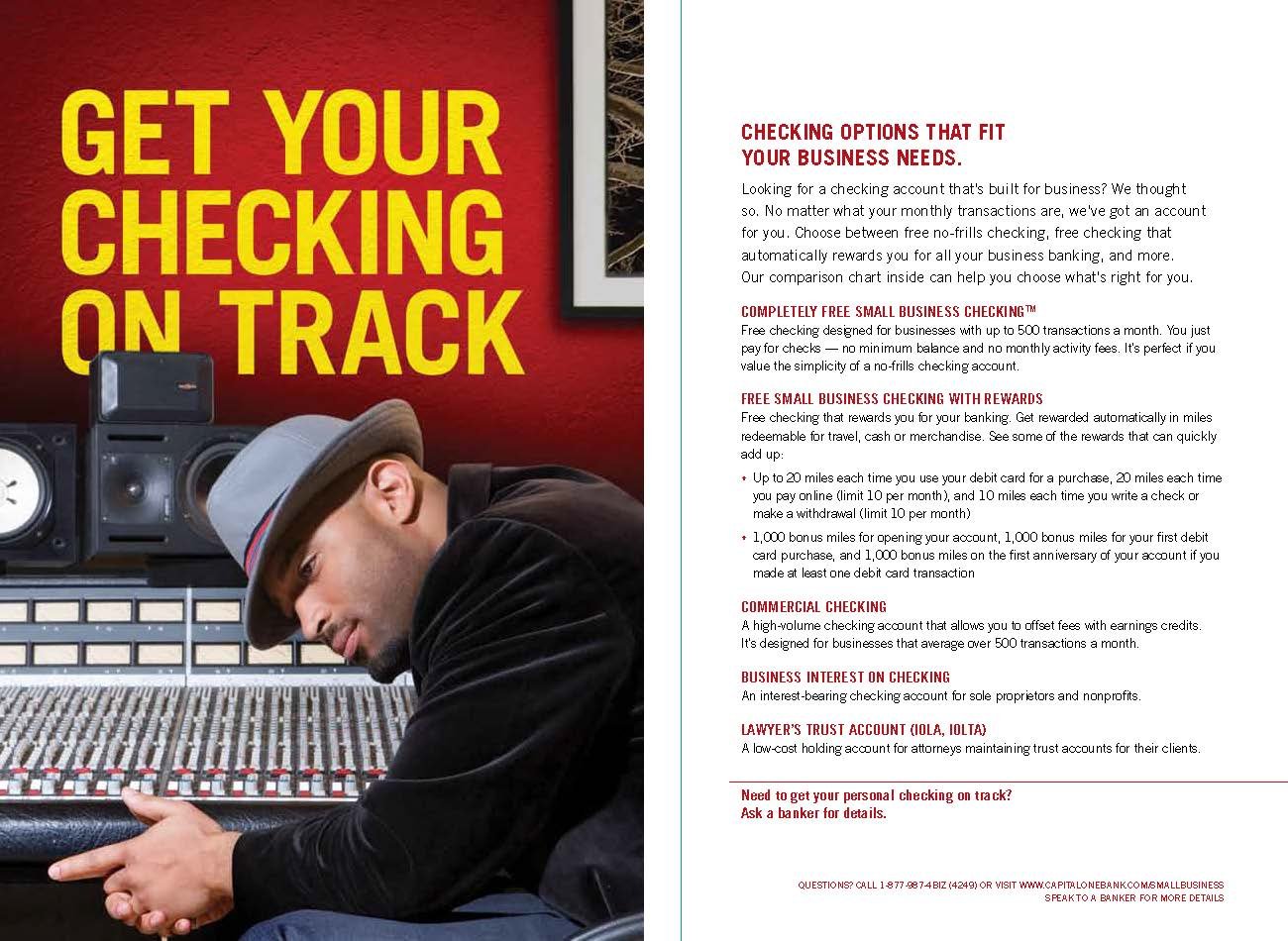
CHALLENGE: Help CapitalOne Bank appear more friendly and personable with a fresh new look and clean simple communications.
SOLUTION: We developed branding with cheerful lifestyle images and a bright poppy palette to play as a backdrop for quirky puns
RESULT: The work we did won us all of the in-store merchandising and CapitalOne’s digital business.
Econocheck Site Update
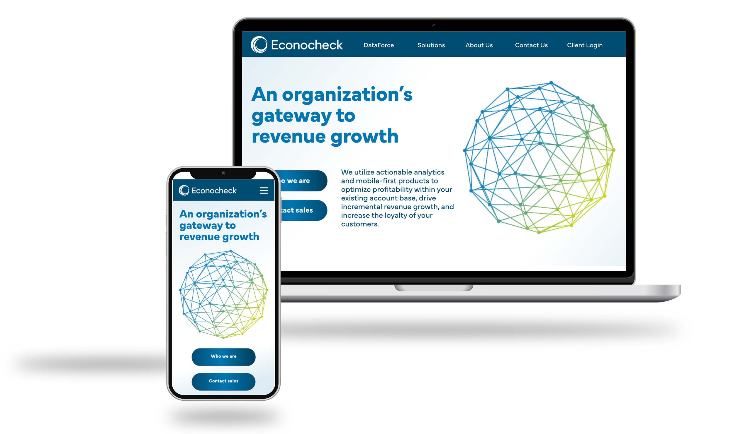
In this website update, we emphasize Econocheck’s authoritative, tech-savvy brand personality.
We’ve adopted a “Gateway” theme, inspired by Econocheck’s role as a doorway to success for financial institutions and other member-based organizations. This theme aligns seamlessly with the brand’s logo, which resembles a gateway or vortex. The design and animation reinforce this idea, showcasing not only financial institutions but also other organizations that can benefit from Econocheck’s industry leadership. The goal is to inspire visitors to engage with Econocheck’s programs and products, ultimately enhancing their organizations.
Visual Direction
The design features thin line art illustrations paired with vibrant gradient colors in a flat design style. This approach evokes the precision of technical drawings, emphasizing the advanced, technological nature of Econocheck’s products. The illustrations are layered with rich gradients in the existing brand colors, creating a visually engaging experience while strengthening brand identity. The overall feel is clean, modern, and focused on delivering clear, impactful information.


